Having a bad looking website, or having a site that doesn’t convey the message businesses should be truly wanting to preach to their prospective tribes, or customers is still something I see happening daily. It’s a shocker!
The New Business Manifesto clearly states, for example, that we now have to be content creators, rather than just marketers. So, it’s important to get the balance between marketing, selling and engaging, right.
All this leads to the following 9 main elements, which makes up the following website checklist, that I believe are imperative for every website to have, in order to become successful and sharable in today’s very social online landscape.
1. Great Looking Header & Logo
Great looking doesn’t mean using ‘flash’ technology, with all the bells and whistles from 2006! It means that your header is simple, clean, effective and above all – memorable. Be sure to utilize your logo properly, and make it the center-piece of your overall header image. Branding is more important today (especially online) than it has been for a long, long time. Note: If you’re building a personal brand, have the focus of your header be on your name – like I do.
In this example from TheMarketingAgents.com we see that the owner, Rich Brooks has utilized great graphical elements to be remembered and talked about. I first heard about this site when Chris Brogan mentioned it on Facebook, than met Rich at NMX in January this year – hes as colorful in person, as his website is (watch out for an interview with Rich coming up soon on the podcast!).
2. Simple Navigation
Anyone landing on your site shouldn’t have to ‘look’ for the navigation area of your site. Use a simple menu below your header to allow people to bounce from one important area of your site, to another. Be sure to not include any more links than is absolutely necessary. I try to limit all the menu’s on my business sites to no more than five links, to allow people to really ‘click’ and not ‘think’ too much.
In the example above, from the Think Traffic site, you see very clearly that the focus is on being very clear on what each of those links provide. I love the simplistic approach that this brings to not only the design of the site, but also, as a visitor, the way I use it.
3. Opt-In Offer

You’ll see in the example to the right, pulled from my Virtual Staff Finder business site, we give away an eBook, which is 11-pages in length, and does the job brilliantly with an average opt-in rate of around 20 a day. See how the cover of the book ‘pops’ out of the blue border? Just a little effect to catch peoples attention. The absolute perfect place to put something like this is at the top of your sidebar, which leads me onto the next item on our checklist…
4. Sidebar with ‘Sticky’ Content
As you will see from surfing around this site, the information that is in the sidebar on my site is always there (except for a couple of ‘conversion focused’ pages, which we’ll go into in a moment). Regardless of what page visitors land on, or what page they navigate to the information in my sidebar is always there. Always static. For my site this includes my opt-in form, a quick ‘about’ blurb for those visitors that may by visiting for the first time, links to my most popular content and an advert to one of my services. Finally, I finish up with a plugin for my Facebook Community, which is growing steadily into an entrepreneurial resource all on its own.
5. Conversion Focused Pages
These are pages that are set-up with one main reason in mind, and no other. To simply convert.
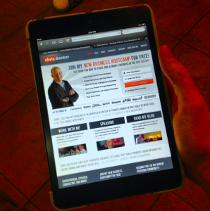
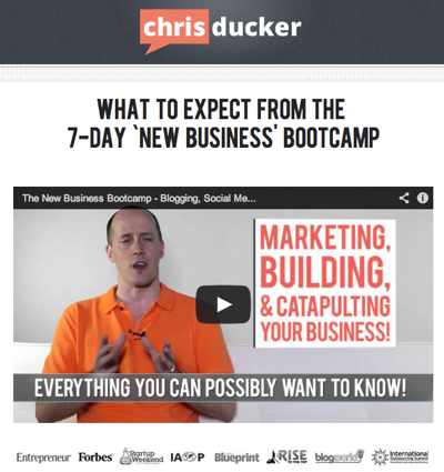
Examples on this site include the ‘New Business Bootcamp‘ info page (see below for a quick screenshot), and my ‘About‘ page. If you click on these links (wait until you finish reading first, okay!), you’ll see that the pages load up in a slightly different format to the rest of the site. These pages are a lot more ‘plain’ looking. They have a more simpler looking header with no links, and the sidebar is complete missing, along with the footer.
The reason behind this is because these pages are there to convert people to my mailing list – nothing else. And they work!
Another perfect example of this ‘conversion focused’ page could be a landing page for a webinar offer, or a product sign-up page, such as this one from Darren Rowse over at Digital Photography School – where he is selling his iPhone photography eBook.
6. Video
Video is massive. It’s bigger and badder online than it EVER has been. The ability to show your real personality is never any easier than it is in video. This is the exact reason why every good small business website should contain at LEAST one video in a prominent location – perhaps the ‘About’ page, maybe the ‘Homepage’ – but, please start using video.
In the example above you’ll see that my buddy, Derek Halpern from Social Triggers shows his true personality (anyone that knows Derek will KNOW this is him!), at the same time as promoting an event – and ultimately making money. Just be yourself, offer value and be a little entertaining, and you’ll be off to the races with video.
7. Blog Section
This’ll probably not come as too much of a shock, but I’m a big fan of blogs and blogging for business. The simple fact that it’s the easiest and quickest way to build reputation, authority and personality in what you do as an entrepreneur and business owner is all you really need to know, to force yourself to get started. And that’s exactly what you need to do – if you’re not blogging already that is. Having a blog on your small business website is an absolute must in today’s market place. Make it happen, and enjoy the benefits of creating original, inspiring and helpful content for your customers, and prospective customers.
8. Social Media Integration
Simply putting your social media links on your site somewhere (usually the header, sidebar, or footer (like me!)) is sometimes enough – but, there are several ways to stand out online, and you’ll see in the example above, how my friend Marcus Sheridan has decided to get his website visitors excited about connecting with them hime via Facebook, Twitter and LinkedIn – as well as how easy he makes it, too!
9. Contact Information
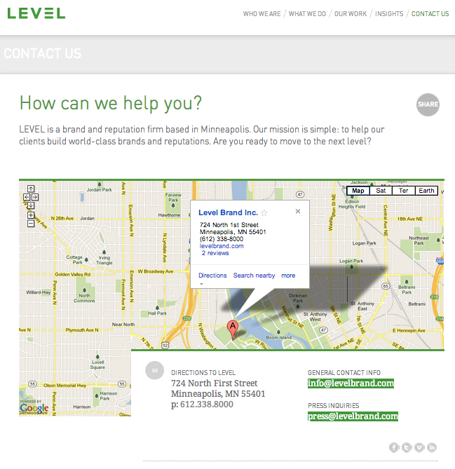
One of the easiest ways to build credibility on your website is to include an address, telephone number and any other information needed for people to get in touch with you and your business. By making a point of focusing on this info, you’re sending a message to your visitors that you’re real and ready to hear from them. If you’re a local business, be sure to include a map on your contact page, too – doing this means that people will be able to find you easily, if they are wanting to come and actually visit you at your place of business – just as LevelBrand (a reputation management company in the USA) has done – example below.
The great thing about your contact page is that you control the way people will get in touch with you. If you want to minimize email, for example, simply don’t include your email address or a contact form – instead, highlight a telephone number, or social media platform that you manage daily.
Need Advice? Want to Pimp Your Website?
Have you recently put together your own small business website? Has this website checklist helped?
Tweet me… and let me know!



 As some of you may know I’ll be in the States for the entire month of July, firstly for Chris Guillebeau’s ‘World Domination Summit’, and then later on in the month for my


 Warning: This post is a little longer than most, includes statistics, numbers and a handful of images, too. If you get a nosebleed from reading it – don’t blame me!
 How did you spend your weekend? I took a break from the usual family time, and hosted a private mastermind session at my facility, here in Cebu, Philippines – and it was awesome!
 As new-age entrepreneurs, doing business in today’s economy, we instantly become content creators.
 I’m currently sitting in a hotel room in San Francisco, where I have been decompressing over the last few days with my wife, following a whirlwind week in Las Vegas for New Media Expo, where I spoke on the subject of teaming up with virtual assistants to outsource the bulk of entrepreneurial content marketing tasks – it was a blast!
