On Monday last week I announced this series of three posts that begins today. I was blown away by all the awesome comments and emails I received. Seriously – you lot are a seriously smart, demanding bunch! Just joking… After digesting everything and going back to my original mindmap for this series, then adding in your suggestions to hopefully fulfill your ‘needs’, here we go…
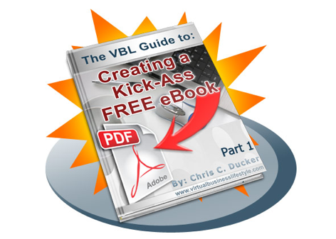
So, today we start the series on how to create a kick-ass free eBook which you can use to help build your brand, as well as help promote and market your blog, product, service, with taking a look at Creating the Concept of your eBook, the time-honored question of ‘Quality, or Quantity’ and how important the Design and Layout of your eBook is.
Initial Housekeeping Notes
Although I have tried to make this series of posts as informative and as easy-to-follow as possible, you might still see the odd crack in the ‘process’ being presented here. This is because, quite frankly, I wanted this to be a simple to follow series, with practical advice and tips, and not go into too much detail on any one subject matter – saying that, there is still plenty of meat on the bones, and if you have any particular questions, feel free to let me know.
Kindly note, this series is about creating a FREE eBook. One that you will give away for absolutely no profit. If you want a more in-depth guide to creating an eBook that you can sell, I strongly suggest you check out Pat Flynn’s eBookstheSmartWay.com (free), and Dave and Naomi’s HowtoSellYoureBook.com (paid) – I’ve read and used BOTH in my eBook marketing, and they’re great.
Most Importantly: Create something that you feel is good enough to sell, but then give it away for free! This will ensure that the quality of your eBook is high, that its incredibly informative and will genuinely make a difference to the reader once they have finished reading it. I did this with ‘Saving the Day, the Virtual Way’, and have had so many awesome emails from people, that it was certainly worth all the effort.
Creating the Concept
First and foremost, don’t write about anything that you know nothing about. It’ll be so obvious that you’re bluffing and simply not worth your time! Secondly, here’s probably the biggest, most important tip you will get from this entire series – write your eBook for your audience, not for yourself. Look into solving problems for other people. If this comes about by taking care of a problem YOU have to start off with, thats fine. Solving problems for people is the oldest and most powerful ‘sales’ strategy out there.
You might have a very clear picture of what you want to write about. If so, and you know it’ll benefit your audience, then go for it! One thing that you should also consider is doing a survey with your current readership first. I did this a while ago when we re-designed the VBL Blog, and I can tell you, the feedback I got was priceless – worth more than any amount of sales, as it allowed me to tweak the design of the site to help people navigate it properly and enjoy their experience on the blog more. I also did something similar when trying to find my ‘core’ readership, and when when asking for feedback on an upcoming product I’m putting together.
Among the most successful digital products out there, almost all of them are ‘How To’ types of products. Your giveaway eBook should be no different. Not only are ‘How To’ guides really simple to put together, but they are easy to read and generally get downloaded more than the other types of freebie eBooks out there.
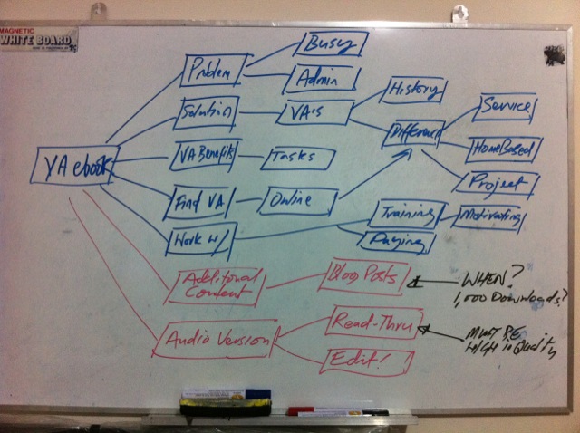
Every good story has a beginning, middle and an end. Your eBook should be no different. So, break your contents down into three main sections. It’s a good idea to sit down and plan this part of your eBook out very clearly. I’m a big fan of mindmaps. I use them, literally, every day. Now I use my iPad to do most of them, but, back in the beginning of 2010 when I produced ‘Saving the Day’, I mapped things out on a small whiteboard I have in my home office.
Here’s a quick snapshot of the original mindmap… You’ll see I already intended to add additional content to it, and make an audio version, even back in those earlier days. Although I did it nearer 3000 downloads, not the 1000 noted here!
Firstly, I presented the problem. I talked about how busy entrepreneurs are, and that if only they had solid, dependable help they could get so much more done on a daily basis. Then, I went into the solution side of things. Again, by way of example, in my free eBook I talk about virtual assistants, what they do, how they do it, etc. Then finally, I wrapped everything up with the ending – what the solution can mean to the person reading. In my case the solution is finding, hiring and working with a VA to enable the busy business owner to gain more time in his/her day-to-day life, create more business ideas, strategize for growth, spend more time with family and ultimately become more successful, all by utilizing a VA.
Quality, or Quantity?
This is a highly debated topic when it comes to giving away a freebie eBook. Fact is, if the eBook has lots of pages, then it looks as if people are getting a lot more for their ‘download’ buck. However, what if all the content on those pages is a load of old rubbish..!?!!
A while ago, when I was discussing how often I was going to be updating this blog, and the struggles I was having in keeping up with the schedule I had put in place, the most commented-on topic was over the fact that quality matters more than anything else. Visitors were very clear that they would rather come to the blog twice a week, or three times a week for QUALITY posts, than five times a week, for soft or ‘weak’ quality posts.
So, bottom line here – quality – every time. The fact is that I’ve downloaded some eBooks that are just a handful of pages long (personally, I wouldn’t call these ‘eBooks’, but rather ‘Special Reports’, or something similar), and they have been great. However, I’ve downloaded 100+ page eBooks for free and they’ve been mediocre at the best of times.
There are a few exceptions to this rule. Namely, Jonathan Mead and Colin Wright – their free eBooks are nothing short of spectacular, and both great in length and content. I’m sure there are more, but these gentlemen really stand out for me, personally. Note: You’ll see interviews with both these guys on the VBL Podcast soon. They are in being edited, as we speak!
Things Not to Forget
There’s a few things that you certainly do not want to forget to include in your eBook. Firstly, make sure you have some kind of disclaimer / copyright page set-up. In my eBook’s I dont go too heavy on this, but I do make sure to tell everyone that they should feel free to distribute the eBook further afield, however, not to remove or edit anything in anyway, shape or form – that just aint cool, baby!
You should also be sure to include some links to other valuable sources, either on your own blog, and other peoples, too. You can also link to relevant products and services that might help people further, too (we’ll go into this a little more on Wednesday) – just be sure not to link-stuff, too much!
And lastly, be sure to hype yourself a little, at least. A simply ‘About the Author’ page is certainly needed, with a nice image.
Design & Layout
Most people I have spoken to on this subject believe that you can have the most amazing design in the world, but if the content is crappy then you won’t get very far, in the overall scope of things. I agree. However, the importance of standing out, and making sure that the design of your eBook is nice, clean, professional and helps to build your brand is, as far as I’m concerned, just as important as the content.
Although I have a flare for creativeness (my father was an architect, my mother an interior designer), I do not know how to use Photoshop, and quite frankly, when I have such phenomenal support around me, there is no real reason for me to learn how to, either. I come up with the concept, sit with my designer and then he will put it all together. We’ll work as a team, finalize the layout template and then he’ll simply dump the rest of the content into the approved layout. Viola! Your eBook will be finished in no time.
Firstly, having a rockin’ cover will certainly help gain attention. Be sure to spend time on the title. Be original here, guys! Innovative, don’t follow… And the internal pages should be on a white background and a dark covered text, just in case the person that downloads your labor of love wants to print it out. I like to keep images to a minimum in my eBooks, this gets the reader to focus on my content, rather than pretty pictures and colors. See some examples from ‘Saving the Day’, below:

Front Cover, Internal Content Page and the ‘About the Author’ Page in “Saving the Day!”
You’ll see with this eBook, I came up with a superhero theme. Hence the title and the colors, and front cover Superman-style logo. I loved this when my designer finished it up – but, I will say, the ‘concept’ was ALL ME!!! 🙂
You’ll also see that we continued to brand the eBook with the logo internally, too (my designers idea, not mine!) and it worked out great! I highly recommend going with a landscape style layout, as its easier to read on a computer screen – the way eBooks should be read – on a monitor. When you’re done with the layout and the design aspects of the eBook get to focusing on the editing of your content.
Go back through what you’ve written. Focus on just the MEAT of the content itself. Any ‘prettying’ of sentences, etc., lose them. As I always say, sometimes less is more. Remember that. This will enable you to create content that is easy to read, keeps people turning (or clicking) the page and ultimately means that the reader experience is top quality all the way to the end of the eBook.
So, that just about wraps up this first installment of this weeks 3-part series. Let me know what you think in the comments below, and in case you have any additional questions on anything that you feel I might have left out on this part part.
If you’d like to see my entire eBook, including the additional content and the AudioBook version, you can download it here.
See you on Wednesday with Part 2 of the series where I go into how you can now use your eBook to start gaining more subscribers, building your email list, and the tools you can use to make this important activity easier and more successful than you can possibly imagine and… how you can STILL make money with your eBook, even though you’re giving it away for free!
If you liked this first installment – Please share on Twitter, or Facebook!
